Accordion menus are very popular since Web 2.0 appeared with new widgets in order to enhance the usability of the sites. The Accordion widget is used to display one page out of multiple sections at a time. It is very useful when the content is very large, but there is a small space to present it. A very good example of an Accordion it is the one provided by jQueryUI, where you can get a good understanding if you are not familiar with the creation of one. In this case, we are going to use some CSS3 properties that are not implemented in all the browsers yet and only are supported by Safari and Chrome. So, this is just an experiment, and should be treated like that. I do not expect anyone to add this to the current projects. However, it is good to start considering some great transitions effects created by CSS3 in near the future.
HTML Structure
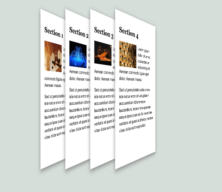
The HTML code is very simple. It is just a div element that is wrapping all the sections of the accordion. Each section is created by an article which contains a title and the content.
      Section 1


         Lorem ipsum dolor sit amet, consectetuer adipiscing elit. Aenean commodo ligula eget dolor. Aenean massa.
         Sed ut perspiciatis unde omnis iste natus error sit voluptatem accusantium doloremque laudantium,
         totam rem aperiam, eaque ipsa quae ab illo inventore veritatis et quasi architecto beatae vitae dicta sunt explicabo.


      Section 2


         Lorem ipsum dolor sit amet, consectetuer adipiscing elit.
         Aenean commodo ligula eget dolor. Aenean massa. Sed ut perspiciatis unde omnis iste natus error sit voluptatem
         accusantium doloremque laudantium, totam rem aperiam, eaque ipsa quae ab illo inventore veritatis et quasi
         architecto beatae vitae dicta sunt explicabo.


      Section 3


         Lorem ipsum dolor sit amet, consectetuer adipiscing elit. Aenean commodo ligula eget dolor. Aenean massa.
         Sed ut perspiciatis unde omnis iste natus error sit voluptatem accusantium doloremque laudantium, totam rem aperiam,
         eaque ipsa quae ab illo inventore veritatis et quasi architecto beatae vitae dicta sunt explicabo.


      Section 4


         Lorem ipsum dolor sit amet, consectetuer adipiscing elit. Aenean commodo ligula eget dolor. Aenean massa.
         Sed ut perspiciatis unde omnis iste natus error sit voluptatem accusantium doloremque laudantium,
         totam rem aperiam, eaque ipsa quae ab illo inventore veritatis et quasi architecto beatae vitae dicta sunt explicabo.
CSS Structure
#accordion {
      margin: 100px;
   }
   #accordion article {
      -webkit-transform: perspective(900px) rotateY(60deg);
      -webkit-transition: all 0.7s ease-in-out;
      background: #fff;
      border: 1px solid #f3f3f3;
      box-shadow: 0px 5px 15px gray;
      float: left;
      height: 420px;
      margin-left: -180px;
      padding: 20px;
      width: 220px;
   }
   #accordion article:first-child {
      margin-left: 0px;
   }
   #accordion article img {
      float: left;
      padding: 0 10px 5px 0;
   }
   #accordion article:hover {
      -webkit-transform: perspective(0) rotateY(-10deg);
      margin: 0 140px 0 -60px;
   }
First, give the accordion element a margin of 100px, just to position it good enough in order to provide space for the animations. Then, utilize the transform property to create a perspective of 900px and rotateY of about 60 degrees. In addition, there is a left margin of -180px in order to make them look close to each other. Using the :first-child pseudo class, the first section of the accordion is positioned with a left margin of 0px because -180 pixels are not necessary and also, it would make it appear out of the accordion.
By adding a transition of 0.7 second, it creates a very nice effect at opening the section of the accordion. I add “all” as shortcut for the transform property and as I am using just the prefix value, prefixed values are not recognized by the browsers in this case.
The last part of the animation is at the moment the user positions the cursor over one of the section of the accordion. This is targeted in CSS with the :hover pseudo class, and it will change the perspective to 0 and the rotate to -10 degrees. Also, it will have a margin necessary to show all the content and separation of other sections.
You can try the demo or download the files to test locally.


